
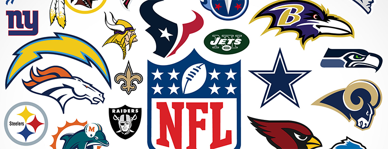
32 NFL logos are proudly worn, stuck, pinned, and painted on by die hard fanatics all over the world. There have even been several fun and interesting series of parodies of each logo from hilarious to vulgar. Despite the reason why one might find themselves routing for a team and rocking their logo, I will objectively examine and assign each one a letter grade based on the design alone. Omitting any personal bias, nostalgia, or geographical favoritism associated with any particular team, I will approach each logo impartially as if viewing it for the first time. Each franchise has several logo variations so I will choose the primary logo delegated to represent each 2017 team that appears on the official NFL website.
Grading criteria:
- Composition and Aesthetic – out of a possible 100
- Creativity and Uniqueness: out of a possible 100
- Color Use: + 2 through 5
Grading formula: (A + B) ÷ 2 + C = grade
Grade scale:
≥ 100 = A+
99 – 93 = A
92 – 90 = A-
89 – 87 = B+
86 – 83 = B
82 – 80 = B-
79 – 77 = C+
76 – 73 = C
72 – 70 = C-
69 – 67 = D+
66 – 63 = D
62 – 60 = D-
59 – 0 = F
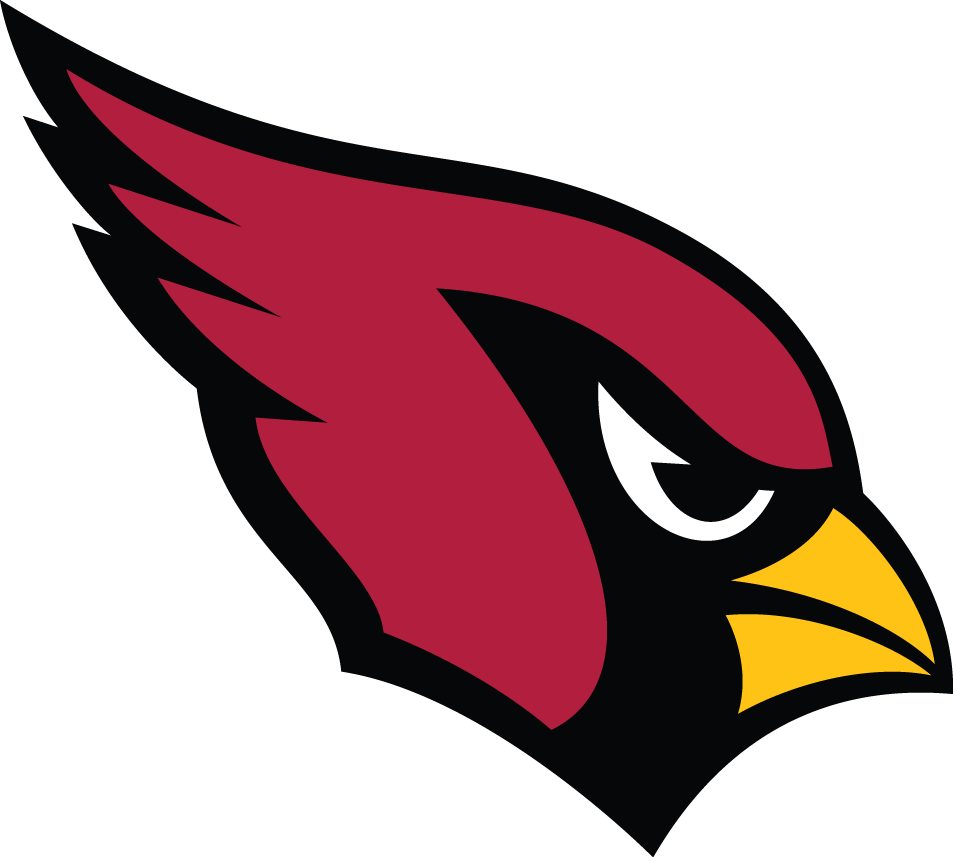
ARIZONA CARDINALS Logo since 2005
Composition and Aesthetic – 90
Creativity and Uniqueness – 69
Color Use: + 3
Grade: 82.5 B
A clean design with a sharp, aerodynamic contour. A personified bird walks the line of cartoony but the facial demeanor grounds it. The black around the eye looks like a warrior’s face paint and creates a clever helmet-like shape of the red. There are a lot of Cardinals in sports and the logos aren’t much different, though I feel this is one of the better executions. A nice value of red but quite common.
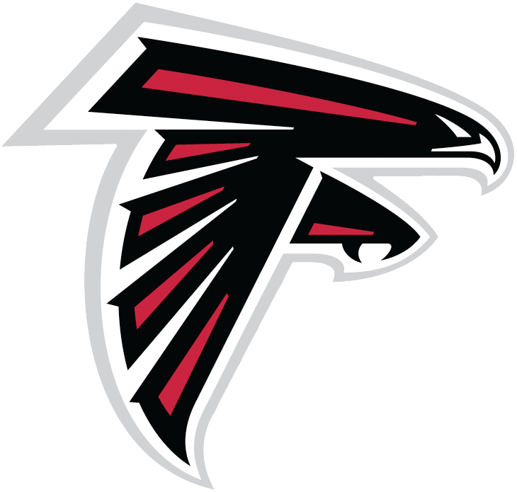
ATLANTA FALCONS Logo since 2003
Composition and Aesthetic – 84
Creativity and Uniqueness – 88
Color Use: + 3
Grade: 89 B+
The slight downward angle creates a nice swoop/attack motion, though the several layers of outlines make it a little busy. A nice use of the falcon to create a subtle ‘F’ shape. Black and red are not terrible colors for a team.
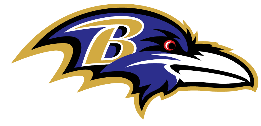
BALTIMORE RAVENS Logo since 1999
Composition and Aesthetic – 74
Creativity and Uniqueness – 62
Color Use: + 4
Grade: 72 C-
The curves and points of the contour spread the eye and bring you back to the bird’s eye. But, too many points for the twice outlined head create a cluttered presentation. Although, I like the unique team name “Raven” and especially appreciate Baltimore’s shot out to Edgar Allen Poe, I’m not grading the name. I like the typography of the ‘B’ but the outline, again, adds to the clutter. The gold contrasts the purple enough without the white. The design could have explored more creativity and the bird’s expression appears slightly ambiguous. The gold complements the purple well. And, not a bad touch of red in the eye.
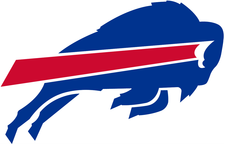
BUFFALO BILLS Logo since 1974
Composition and Aesthetic – 90
Creativity and Uniqueness – 79
Color Use: + 3
Grade: 87.5 B+
A simple design with a clean, linear, retro look. A strong leaping motion exemplified by the red band is a fitting football logo. I would like to see a little more definition where the horn bleeds into the eye but that is a small detail. Red, white, and blue, low risk low reward.
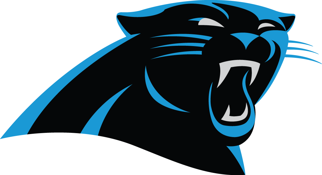
CAROLINA PANTHERS Logo since 2012
Composition and Aesthetic – 90
Creativity and Uniqueness – 85
Color Use: + 4
Grade: 91.5 A-
Simple geometric shapes create the highlights that define a clean, slightly deco panther portrait. The thickness decision of the neck/back along with the sloping base imply a fierce defensive posture. The aquatic blue represents the state of North Carolina as it contrasts well with the dark black. Too bad I can’t through in some extra points for their sparkly helmets.
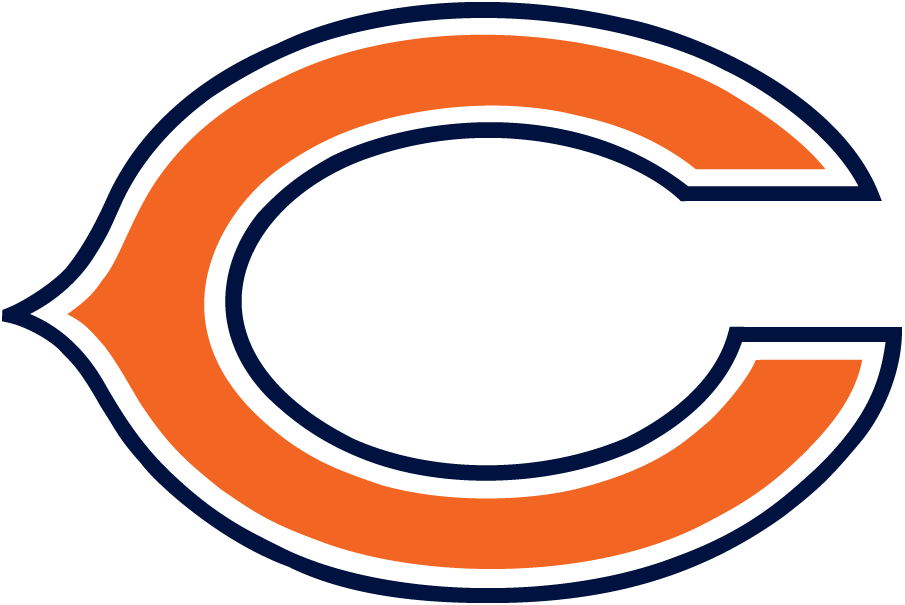
CHICAGO BEARS Logo since 1974
Composition and Aesthetic – 69
Creativity and Uniqueness – 45
Color Use: + 3.5
Grade: 61 D-
Very simple, which I like, but not all that strong on its own (looks better on the helmet). The white and blue outlines give it a little more character but takes away from the simplicity. The old style “C” is fitting for the historical Chicago club, but not all to unique as it appears in several other team logos and better executed in the “Reds” baseball team logo. Also, the vertical symmetry is off just enough to want it to either align or separate more. The rich hues of blue and reddish-orange compliment very well. Bear fans don’t worry, any of the existing alternate bear logos would bear a higher score.
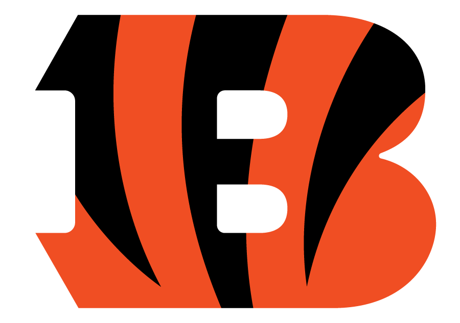
CINCINNATI BENGALS Logo since 2004
Composition and Aesthetic – 84
Creativity and Uniqueness – 70
Color Use: + 4.5
Grade: 81.5 B-
I love the design of the stripes, in fact, I feel the Bengals have one of the best helmet designs. They are placed thoughtfully into this B, which is a fine B, and a clean execution but, the 1997 Bengals logo was just as clean, yet a little more interesting. I’m not sure why a move was made from the Bengal tiger’s head to just a “B”. This logo is OK but the previous may have received a little higher grade in creativity and uniqueness. As for the colors, you don’t see black and orange too often in sports, but the halloween cat colors work well in the logo and on the field.
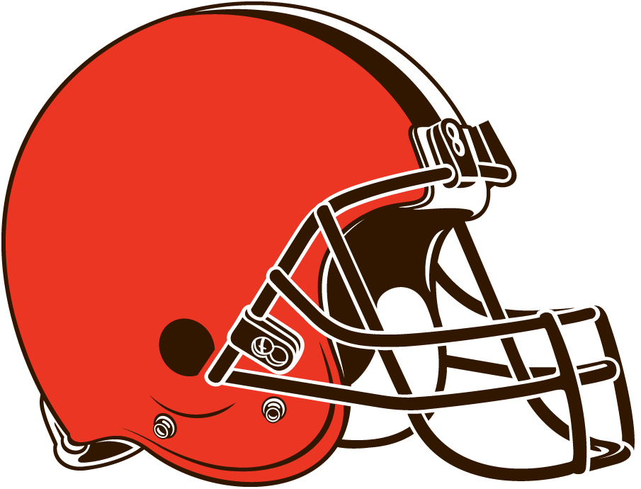
CLEVELAND BROWNS Logo since 2015
Composition and Aesthetic – 55
Creativity and Uniqueness – 11
Color Use: + 3
Grade: 36 F
Too much tight detail for a logo that looks more like a clip-art graphic. There have been several slight renditions of this helmet since 1970. Though the 70s version was probably the cleanest. I would like to see a reintroduction of the 1960s Elf. I do like the unique void of a typical mascot but the creative opportunity at a logo falls short. Brown and orange are an uncommon and humble color combination in pro-sports that I can appreciate, though the orange’s value gets progressively darker each version. A slightly lighter orange would better accompanied this brown.
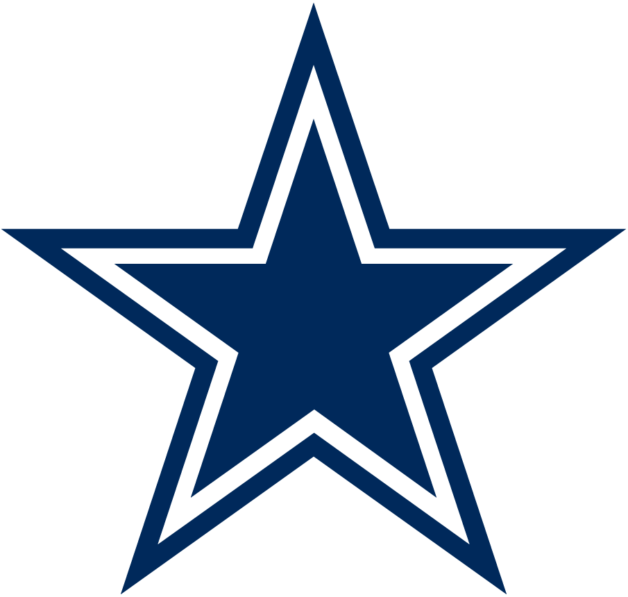
DALLAS COWBOYS Logo since 1960
Composition and Aesthetic – 95
Creativity and Uniqueness – 69
Color Use: + 3
Grade: 85 B
A five point star is a strong geometric shape. It’s diameter occupies a radial space and draws the line of sight outward and back in. Though the Cowboys didn’t invent the star shape, adding the thick outline retains the simplistic, clean look and distinctively brands the ball club with a lone star. Deep blue and white won’t win any innovation awards but clean Dallas colors work for a clean bold logo.

DENVER BRONCOS Logo since 1997
Composition and Aesthetic – 90
Creativity and Uniqueness – 87
Color Use: + 4
Grade: 92.5 A
The direction of the hair and curves of the head create a sense of galloping speed. The use of color highlight the clean, geometric details that successfully suggest organic movement and deliver an almost smooth, metallic texture. The spacing of each detail comfortable.

DETROIT LIONS Logo since 2017
Composition and Aesthetic – 82
Creativity and Uniqueness – 75
Color Use: + 3.5
Grade: 82 B-
A slightly adjusted logo made this year in 2017. A powerful pouncing pose looks mighty fine and appropriate. The implied motion is pleasing, though I feel the execution of the outlines are too much and clutters the piece. The upper paw touching the chin is slightly conflicting to my eye. Replacing the old black with the new silver softens the color pallet and it feels more wintery. The cool colors embrace Detroit’s brisk football weather.
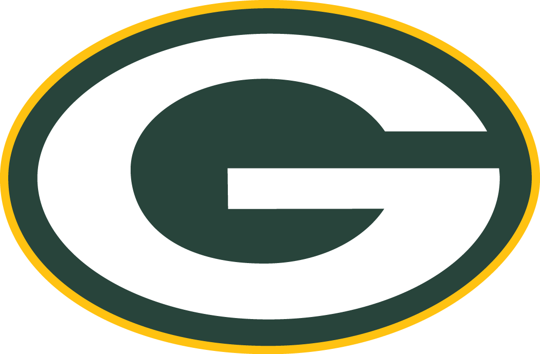
GREEN BAY PACKERS Logo since 1980
Composition and Aesthetic – 78
Creativity and Uniqueness – 45
Color Use: + 3
Grade: 64.5 D
Very simple and easily applicable in multiple formats. The slight oval ‘G’ within an outline doesn’t’ deliver much brand distinction but an overly simple logo is better than an awful logo. Great team color choices to represent northern Wisconsin, however the use of it within the logo seems as an afterthought.
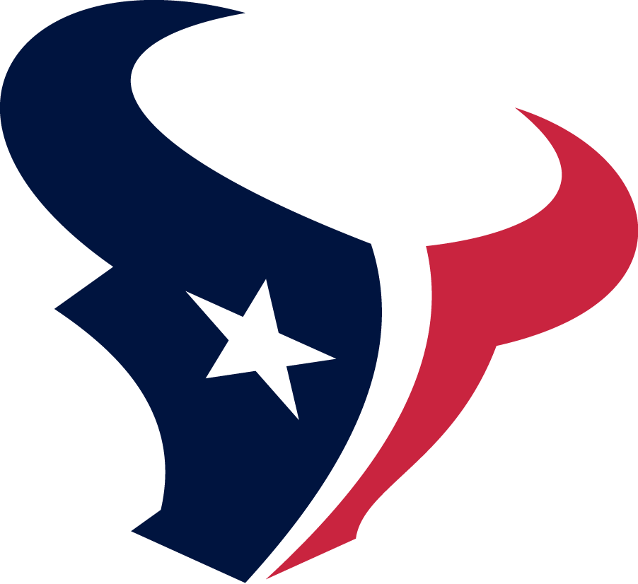
HOUSTON TEXANS Logo since 2002
Composition and Aesthetic – 91
Creativity and Uniqueness – 89
Color Use: + 3
Grade: 93 A
The abstract steer creates an interesting shape. A nice perspective choice slightly warps into a forward charging direction. I appreciate incorporating local elements into team logos as the Lone Star State flag is represented. We’ll see these colors a few more times again.
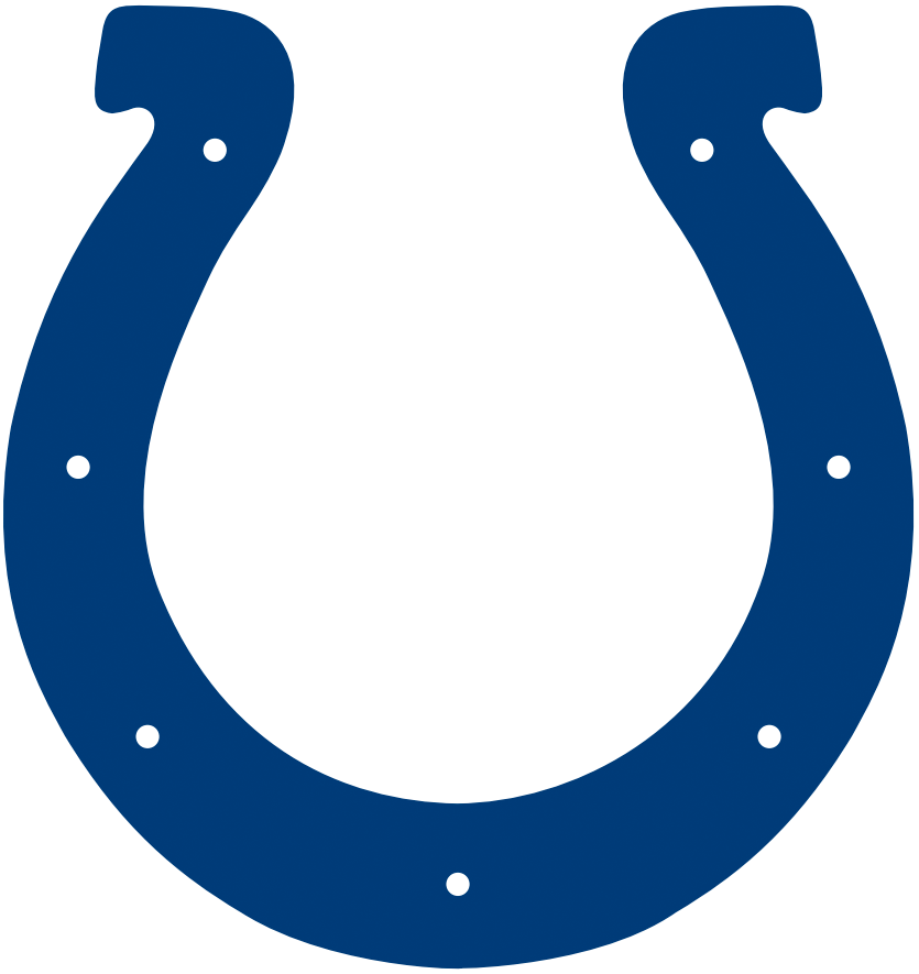
INDIANAPOLIS COLTS Logo since 2002
Composition and Aesthetic – 89
Creativity and Uniqueness – 82
Color Use: + 3
Grade: 88.5 A-
I like the simplicity and lateral direction of this colts logo to go with a horse shoe than an actual colt image. This is the same logo as the 1984 logo, only altering the hue of blue.
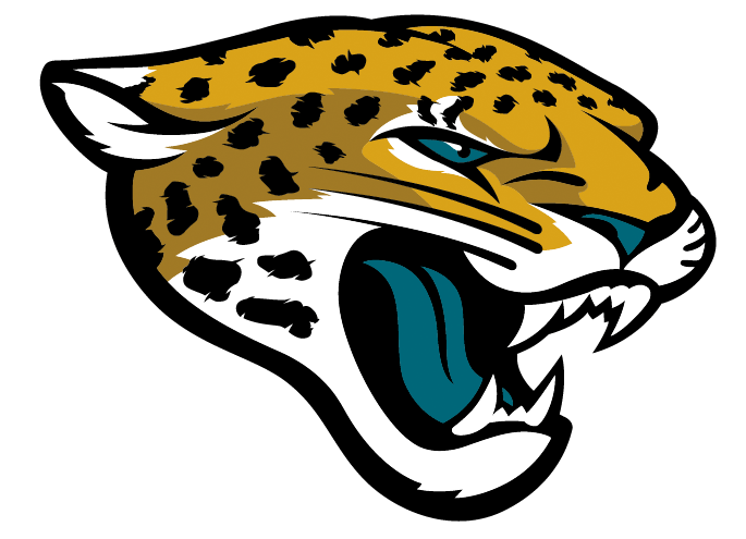
JACKSONVILLE JAGUARS Logo since 2013
Composition and Aesthetic – 90
Creativity and Uniqueness – 86
Color Use: + 5
Grade: 93 A
Ears down, good facial proportions, and nice thick lines balance the, almost too many, detailed features. Excellent and refreshing color choice for a team and wonderful, balanced use within the logo.
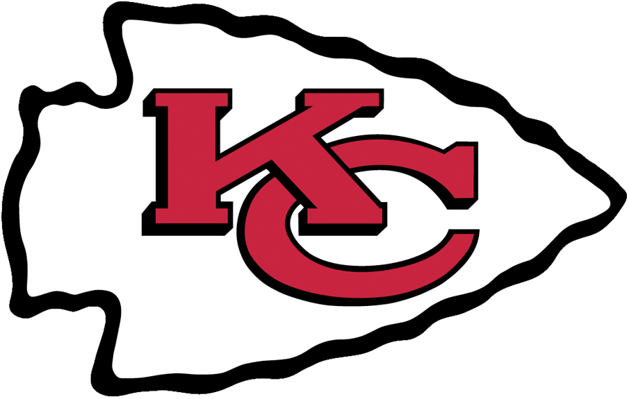
KANSAS CITY CHIEFS Logo since 1972
Composition and Aesthetic – 64
Creativity and Uniqueness – 68
Color Use: + 3
Grade: 69 D+
Arrowhead can be a strong visual element but along with the slightly beveled and stretched letters, it comes off a little cartoon-y.
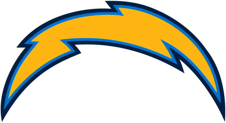
L.A. CHARGERS Logo since 2017
Composition and Aesthetic – 75
Creativity and Uniqueness – 70
Color Use: + 3.5
Grade: 76 C
The logo does look better on a helmet than standing alone. An older version of a thinner bolt looks a bit more sleek. The arch of the bolt stagers the adjacent points a bit too unevenly. The three colors meld together well harnessing that southern coastal vibe.

L.A. RAMS Logo since 2017
Composition and Aesthetic – 92
Creativity and Uniqueness – 86
Color Use: + 3
Grade: 92 A-
This is one of the occasions where the stroke helps a bit. The thick outline creates an almost vibrant radiance as if the horns are reverberating after a strike. The extreme point at the back end increases the sense of force. Moving to one color really cleans up this newer look.
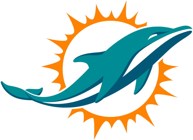
MIAMI DOLPHINS Logo since 2013
Composition and Aesthetic – 90
Creativity and Uniqueness – 90
Color Use: + 5
Grade: 95 A
A clean, sleek shape encompassed by a radial burst that cleverly doubles as an abstract sun. Good use of negative space to utilize direction. A beautiful combination of colors highlight subtle depth. Warm, aquatic, and deco, a well done logo for Miami.
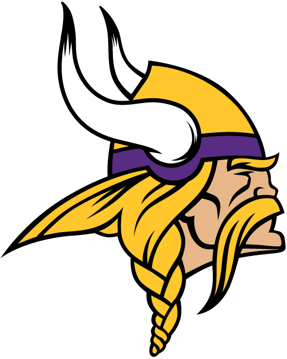
MINNESOTA VIKINGS Logo since 2013
Composition and Aesthetic – 89
Creativity and Uniqueness – 90
Color Use: + 2.5
Grade: 92 A-
Logos with non-abstract humanoid faces are tricky to pull off. I believe this one does with help from slightly geometric features and hidden eyes. An interesting mascot is drawn with a very interesting contour shape. My only big complaint, is the use of color. I’d like to see more purple in this field of overwhelmingly yellow hues.
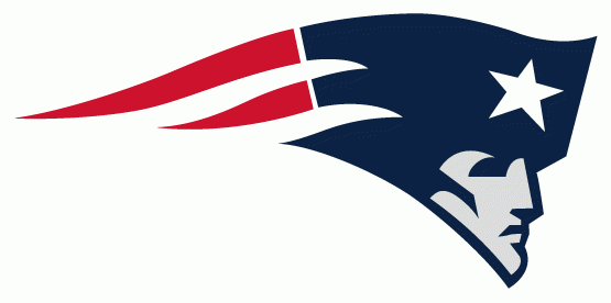
NEW ENGLAND PATRIOTS Logo since 2000
Composition and Aesthetic – 89
Creativity and Uniqueness – 90
Color Use: + 3.5
Grade: 93 A
A clean, sharp logo that resembles a waving flag. Just a color refresh from their 1993 logo. The darker blue works better and the silver is a nice cool touch.
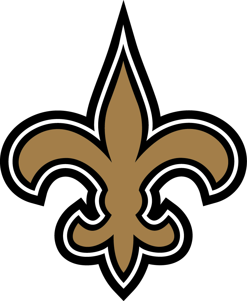
NEW ORLEANS SAINTS Logo since 2000
Composition and Aesthetic – 82
Creativity and Uniqueness – 70
Color Use: + 4
Grade: 80 B-
Another common shape branded as their own. Although not as strong as the geometrically balanced star, the bold symmetry of this “fleur-de-lis” is nice. The three outlines begin to crowd the contour. I do like the dark, rustic color choice.
![]()
NEW YORK GIANTS Logo since 2000
Composition and Aesthetic – 80
Creativity and Uniqueness – 46
Color Use: + 3
Grade: 66 D
A simple, slightly stylized ’N’ and ‘Y’ isn’t all too exciting but fits together well. Doesn’t speak too much of New York or “Giants”.
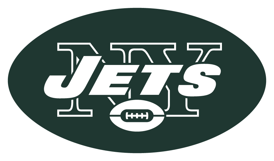
NEW YORK JETS Logo since 1998
Composition and Aesthetic – 69
Creativity and Uniqueness – 30
Color Use: + 3
Grade: 52.5 F
The solid “Jets” over top an outlined “NY” is a little busy to read. An oval football inside a larger oval feels a little redundant. Again, doesn’t speak too much of New York or “Jets”. I like the simple green and white but it really doesn’t do much for the logo.
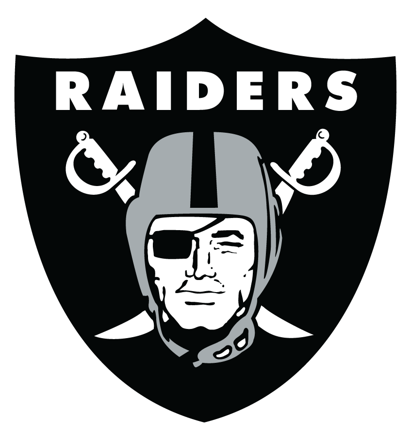
OAKLAND RAIDERS Logo since 1995
Composition and Aesthetic – 86
Creativity and Uniqueness – 86
Color Use: + 3
Grade: 89 B+
An interesting design in a nice strong badge. I not sure the name needs to be within the badge but it doesn’t ruin the composition. The details get a little busy around the chin strap, but a good choice to represent the name and the history of the game. Colors are dark and neutral.
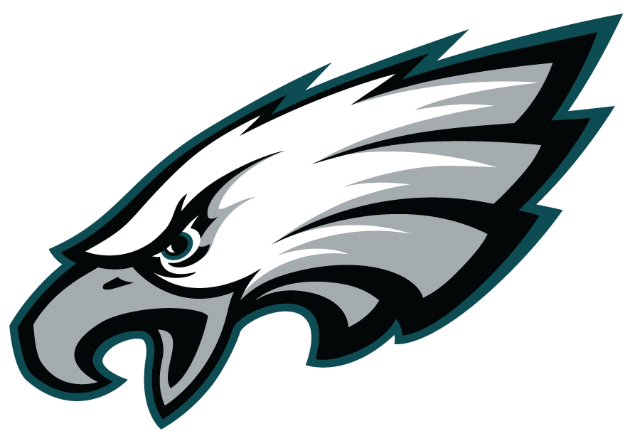
PHILADELPHIA EAGLES Logo since 1996
Composition and Aesthetic – 90
Creativity and Uniqueness – 86
Color Use: + 3
Grade: 91 A-
A good take on a common bird mascot. Good downward angle implies a dominant swooping motion. When you enlarge this logo the details really stand out, yet when scaled down they blend in well. A subtle hue of dark green goes well with the silver and black.

PITTSBURGH STEELERS Logo since 2002
Composition and Aesthetic – 82
Creativity and Uniqueness – 60
Color Use: + 3
Grade: 74 C
Without diving too much into the history or this logo or NFL logos in general, the imagery was originally designed for promoting the steel industry. The team adopted this design as a regional trade representation. Slightly interesting geometric shapes fit within a basic radial shape. The small text inside gets lost a little when scaled down in size.

SAN FRANCISCO 49ERS Logo since 1996/2009
Composition and Aesthetic – 55
Creativity and Uniqueness – 25
Color Use: + 3
Grade: 43 F
Simple but a little too simple. A missed opportunity to play with the historical reference of the unique team name, the city, or the numerical attributes. Colors are nice and rich.

SEATTLE SEAHAWKS Logo since 2012
Composition and Aesthetic – 90
Creativity and Uniqueness – 90
Color Use: + 4
Grade: 94 A
The overall shape isn’t all too dynamic, but the details that make up the face are very interesting and creatively done. The almost wood carved, totem style features are very pleasant. The introduction of the more neon green really excites the color pallet.

TAMPA BAY BUCCANEERS Logo since 2014
Composition and Aesthetic – 89
Creativity and Uniqueness – 89
Color Use: + 3
Grade: 92 A-
Though similar concept, the details of this newest rendition is much cleaner than the former, sloppier version. Broad curves display a nice waving motion and the tethered ends are a nice touch. BTW this design looks great wrapped around the helmet.

TENNESSEE TITANS Logo since 1999
Composition and Aesthetic – 93
Creativity and Uniqueness – 85
Color Use: + 4
Grade: 93 A
Simple, but thick bold shapes combine into a decent overall image. The biggest success is the way the colors work with the elements to create a sense of motion and subtle depth in the ‘T’.
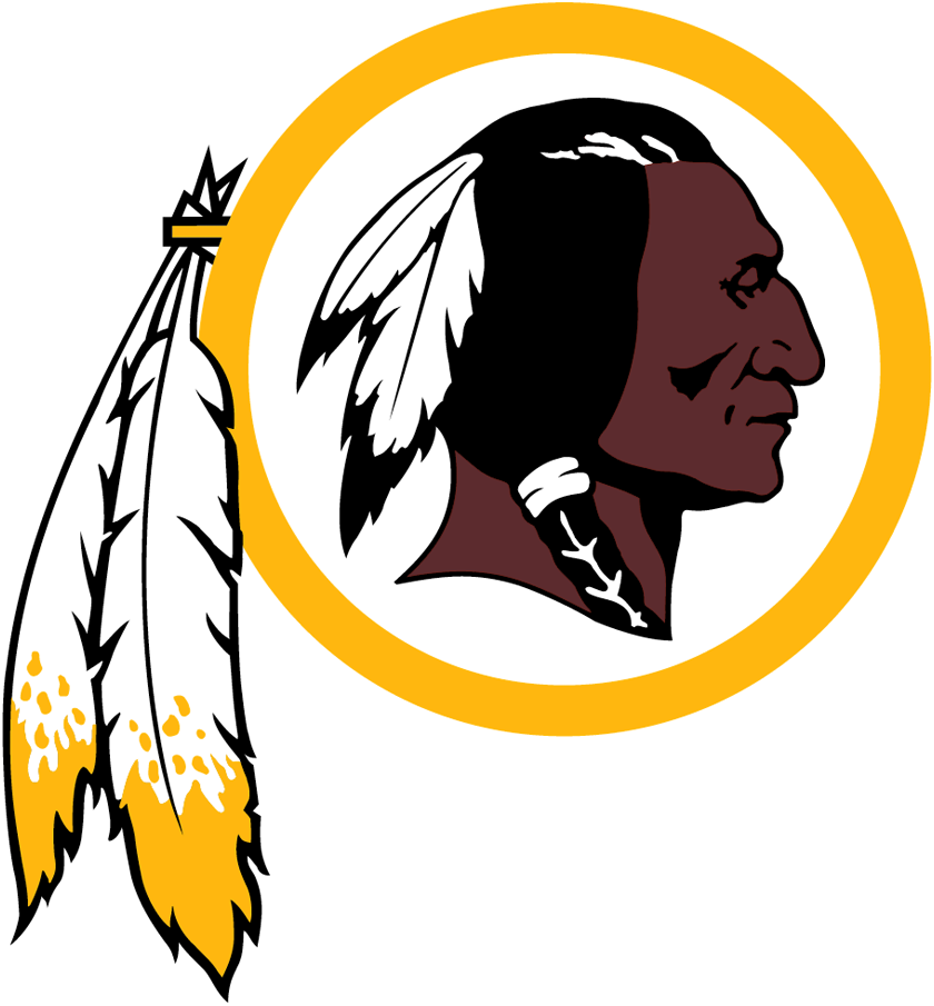
WASHINGTON REDSKINS Logo since 1972-81 and 1983
Composition and Aesthetic – 71
Creativity and Uniqueness – 73
Color Use: + 3
Grade: 75.5 C
This is a design that has been revisited a couple times by the team. It is important to note that a lot of consultation and discussion has went into the execution of this logo. Much time and thought is apparent in the design, but I will be grading the current aesthetics. The radial shape with protruding feathers creates a nice contour. Though, the two sets of leaves feels slightly redundant. As mentioned before, humanoid faces are tricky to successfully brand as a logo. Overall I feel there are too many graphic elements existing in the composition but the use of negative space in and around the details help with that.
DISCLAIMER: All logos and team names are trademarks™ or registered® trademarks of their respective holders. Use of them does not imply any affiliation with or endorsement by them.