
Typography is a crucial element of good design. It is the visual voice that directly communicates to the reader and bridges imagery and meaning together.
Three points to consider when incorporating text are Relevance, Readability, and Placement.
Relevance
Type can portray a sense of personality. Themes can feature sharp or rounded corners, thin or thick strokes, swooping or jagged embellishments that contribute to an overall look and feel that represent your words and message. Is your message meant to sound modest, loud, happy, or smart? Is your goal to display a primitive, modern, or futuristic motif?
Historical and geographical relevance is something to consider as well. The origin and associative use of certain fonts can have an impact on your audience.
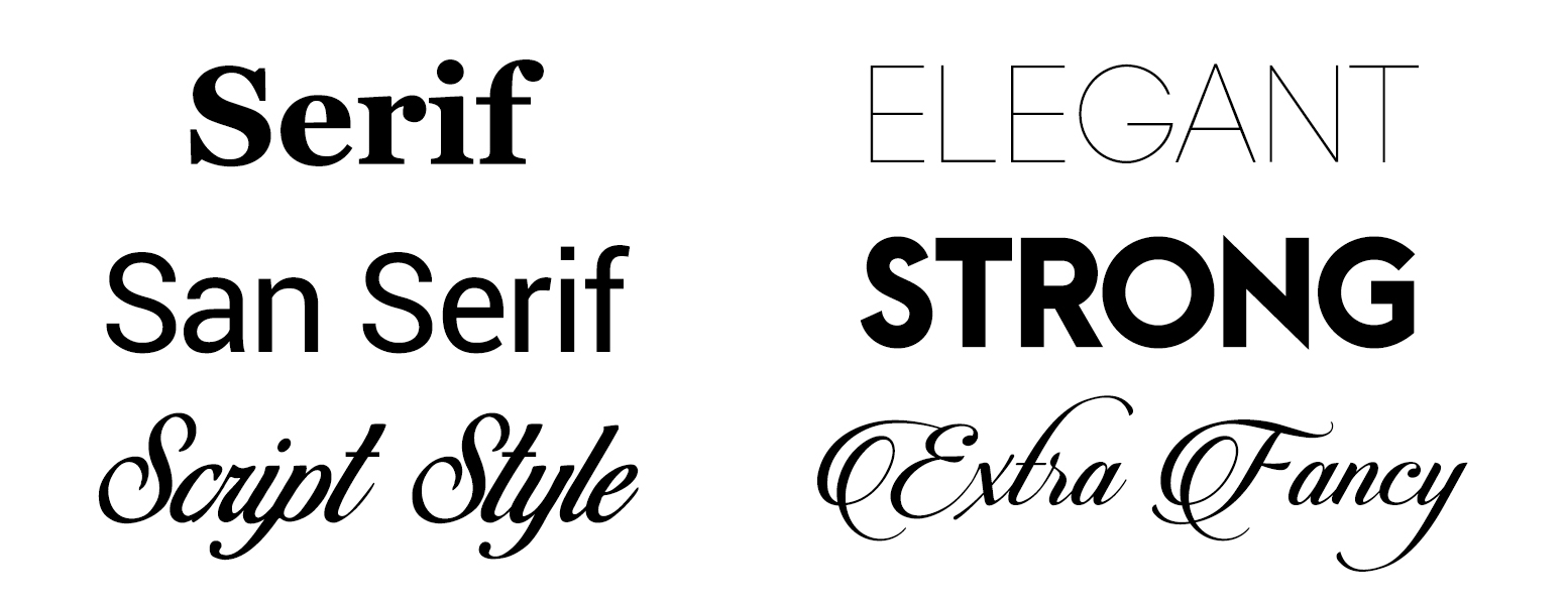
Serif and San serif Typefaces can reflect different moods and resemble designs of the past, present, or future. Script fonts can have accentuating flourishes to over emphasize formality or tradition. Thinner strokes can feel more elegant where bolder strokes may emit strength.
Some typefaces have recognizable character inspired by creative methods and stylings of specific regions or cultures. And many others are developed specifically to represent a desired look or emotion.
Choosing a typeface with a lot of distinguishable character may appear interesting, but be aware of fonts that are recognizably over used or commonly associated with a specific brand as it may dull your creative impact. Find a fitting balance between an interesting look that works well within your layout.
Using multiple typefaces might clutter up a layout and create a conflict of style. A safe practice to avoid such disarray, is to stick with two fonts in your article that complement each other, or just one font family with different weights or variations.
Readability
Legible type is only as important as the need for your viewer to read it. There are instances where type is used more as a graphical image than as a source of written communication. However, in most cases readability is the function of your design.
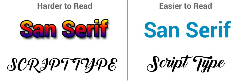
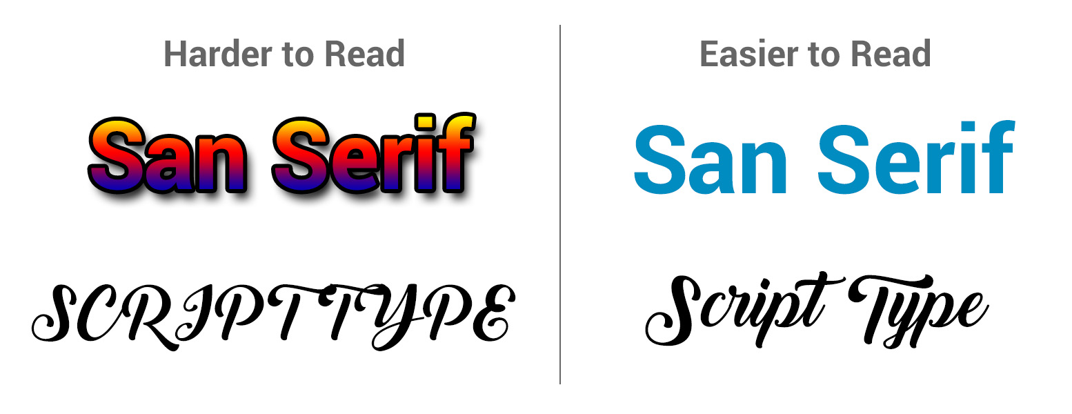
Typefaces with extreme accents or stylization may work fine as a header but become difficult to read as body copy or even long sentences. Applications such as drop shadows, gradients, outlines, and ALL CAPS can affect the readability of type. Even if the text is legible, these effects can make the copy uninviting to read.
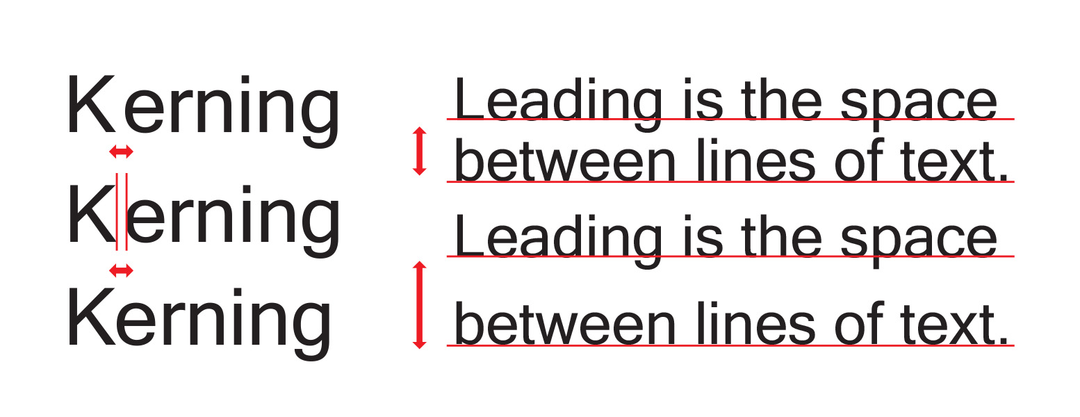
Color can also be a tricky treatment to apply. Light color values on light backgrounds can be hard on the eyes. Even black type on white can appear harsh or blunt in some contexts. Try to avoid stretching fonts outside their stroke weight ratios. Skewed text can be uncomfortable to read. You can adjust leading and kerning to get copy to fit more pleasantly.
Using text over an image is another subjective technique. Depending on the photo, and size of text, it can often be very distracting to comprehend.
Although these scenarios will greatly depend on the assets you are using and your own judgment, the beauty of working with type is the creative adaption you can apply to deliver the information.
Placement
Poor placement can fracture the flow of a layout. Whether you are designing for print articles, websites, or keychains, element placement is a key component to typographical hierarchy. Design Hierarchy not only highlights the level of importance within the content, but contributes to the level of frustration the reader may or may not have as they navigate the content.
Be thoughtful with your alignment and spacing. Blocks of text will begin to create shapes that can help the flow of information. Most editing programs offer grids or alignment tools. Observe how text line heights and base lines align with each other. Lines of text that are not aligned can create visual chaos.
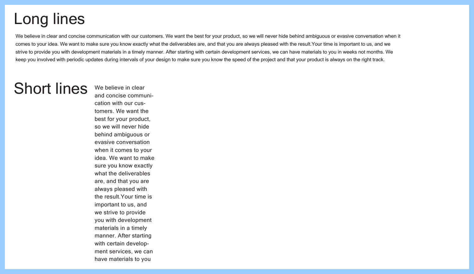
Copy with several lines of text can become more difficult to read if center aligned. Breaking up groups of text can help with eye flow as well. Keep in mind, long lines of text may become challenging to determine where the next line begins and lines that are too short may cause uncomfortable reading rhythm and excessive hyphenation. Choose your returns wisely and utilize multiple columns when necessary.
Consistency is critical to execute, especially if you have a multi-page layout or web program. When headers, titles, and navigation are placed consistently readers can locate them easier. This also projects stability and a more pleasant viewing experience.
The successful application of type will harmoniously communicate your work and avoid visual dissonance between your text and your message. Although following the standards of typography may not always be required in exercising creativity, knowing and understanding the basic concepts of type will help you follow or break the rules in producing something meaningful.
——-
Enhance Product Development is a professional design firm that specializes in launching new products for inventors, entrepreneurs and start ups. For product development inquiries please contact Enhance Product Development at https://enhancepd.com/contact/ or call us at 877-993-6426.
Related Links: